Everlong Captive
PROJECT OVERVIEW
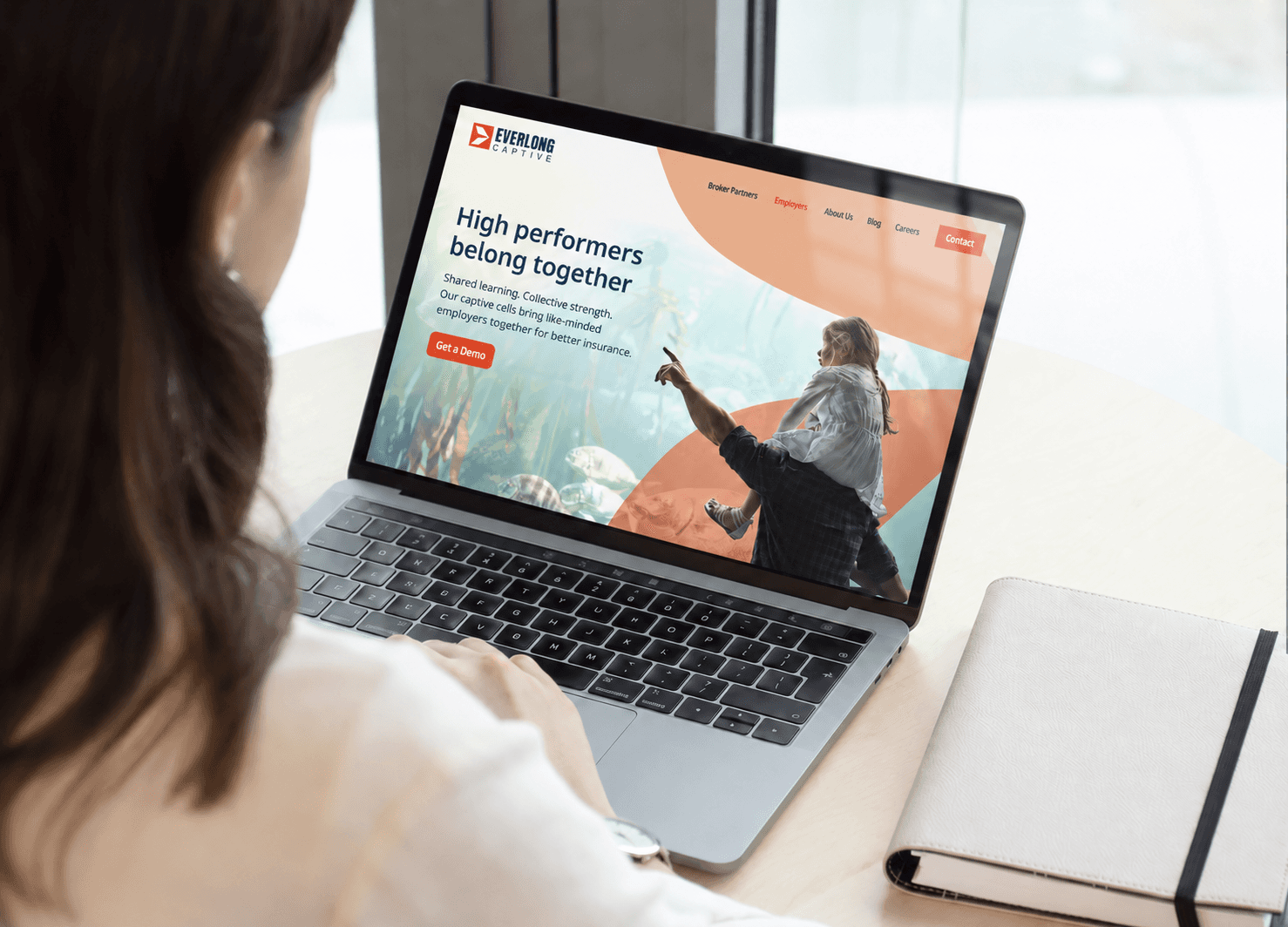
Everlong Captive helps mid-market employers participate in member-owned healthcare insurance captives, offering greater transparency, control, and long-term value than traditional insurance structures. I developed a clearer brand identity and visual system designed to make that sophisticated ownership model feel credible, understandable, and ready to scale.
ROLE
Brand Designer
SCOPE
Brand Identity & Campaign Design
INDUSTRY
Healthcare & Employee Benefits
Everlong Captive
PROJECT OVERVIEW
Everlong Captive helps mid-market employers participate in member-owned healthcare insurance captives, offering greater transparency, control, and long-term value than traditional insurance structures. I developed a clearer brand identity and visual system designed to make that sophisticated ownership model feel credible, understandable, and ready to scale.
ROLE
Brand Designer
SCOPE
Brand Identity & Campaign Design
INDUSTRY
Healthcare & Employee Benefits
Everlong Captive
PROJECT OVERVIEW
Everlong Captive helps mid-market employers participate in member-owned healthcare insurance captives, offering greater transparency, control, and long-term value than traditional insurance structures. I developed a clearer brand identity and visual system designed to make that sophisticated ownership model feel credible, understandable, and ready to scale.
ROLE
Brand Designer
SCOPE
Brand Identity & Campaign Design
INDUSTRY
Healthcare & Employee Benefits
01 / BRAND IDENTITY
Making ownership feel clear and credible.
The identity reframed Everlong as a performance-minded healthcare ownership platform rather than another traditional insurance provider. A confident symbol, restrained color architecture, and direct messaging give the brand authority without making the subject feel institutional or distant.
01 / BRAND IDENTITY
Making ownership feel clear and credible.
The identity reframed Everlong as a performance-minded healthcare ownership platform rather than another traditional insurance provider. A confident symbol, restrained color architecture, and direct messaging give the brand authority without making the subject feel institutional or distant.
01 / BRAND IDENTITY
Making ownership feel clear and credible.
The identity reframed Everlong as a performance-minded healthcare ownership platform rather than another traditional insurance provider. A confident symbol, restrained color architecture, and direct messaging give the brand authority without making the subject feel institutional or distant.


02 / VISUAL SYSTEM
A flexible system for a complex story.
The visual language creates a consistent bridge between financial performance and human wellbeing. Editorial typography, bold image crops, and a focused palette give the team a repeatable toolkit for explaining the model across digital campaigns, presentations, and sales communication.
02 / VISUAL SYSTEM
A flexible system for a complex story.
The visual language creates a consistent bridge between financial performance and human wellbeing. Editorial typography, bold image crops, and a focused palette give the team a repeatable toolkit for explaining the model across digital campaigns, presentations, and sales communication.
02 / VISUAL SYSTEM
A flexible system for a complex story.
The visual language creates a consistent bridge between financial performance and human wellbeing. Editorial typography, bold image crops, and a focused palette give the team a repeatable toolkit for explaining the model across digital campaigns, presentations, and sales communication.


03 / APPLICATIONS
Built to work beyond the brand book.
The system was extended into campaign, environmental, and communication pieces that could carry one recognizable voice across very different contexts. Each application keeps the identity disciplined while allowing photography and messaging to do the storytelling.
03 / APPLICATIONS
Built to work beyond the brand book.
The system was extended into campaign, environmental, and communication pieces that could carry one recognizable voice across very different contexts. Each application keeps the identity disciplined while allowing photography and messaging to do the storytelling.
03 / APPLICATIONS
Built to work beyond the brand book.
The system was extended into campaign, environmental, and communication pieces that could carry one recognizable voice across very different contexts. Each application keeps the identity disciplined while allowing photography and messaging to do the storytelling.


